创意美食海报与排版交互设计
来自 OpenNana 的公开提示词;保留原始作者与公开原帖引用。
ChatGPT参考图要求未核实图像提示词
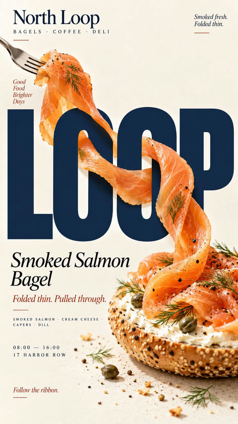
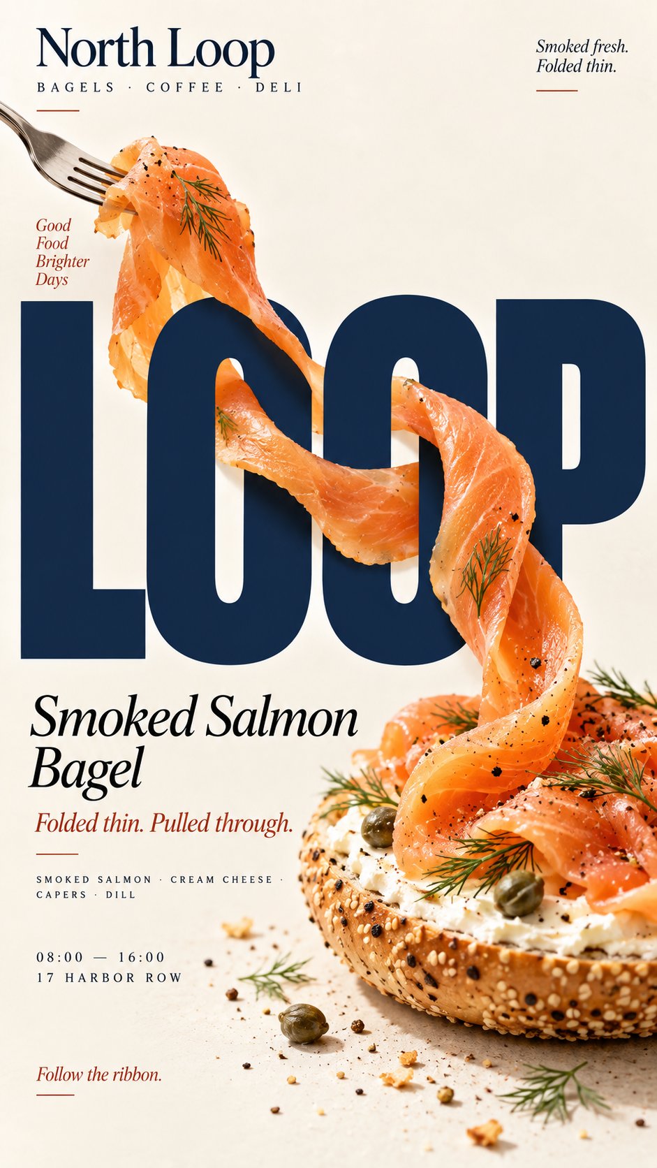
完整 Prompt
[BRAND]: {brand name}
[PRODUCT]: {food / dish}
[HEADLINE]: {short bold word}
[INTERACTION]: {through counters / grip letters / wrap around strokes / fold through type}
[FOOD ELEMENT]: {salmon ribbon / octopus tentacle / citrus peel / pasta sheet / other suitable food}
[ACCENT COLOR]: {headline color}
[DETAILS]: {ingredients / short copy / hours / address}

Create a 9:16 vertical food editorial poster combining highly realistic food photography with large, professionally designed typography.

Use a warm cream or ivory background, subtle paper texture, clean editorial composition and minimal props.

Keep [HEADLINE] large, flat, sharp and fully readable. The food must remain a real independent ingredient and physically travel through the typography according to [INTERACTION].

For “through counters,” let the food clearly enter and exit the open spaces inside letters, with believable front and back occlusion.

For “grip letters,” let a natural part of the food physically attach to or hold a letter while the typography itself remains unchanged.

For “wrap around strokes,” use one continuous edible element to move in front of, behind and around different letter strokes with a traceable path.

For “fold through type,” use a broad flexible food sheet with visible thickness and real food texture, folding between the front, back and negative spaces of the letters.

Every interaction must have clear depth. Food in front of type should cast subtle contact shadows; food behind type should be genuinely hidden. Keep the food’s texture, thickness and direction continuous so the viewer can trace the same ingredient through the composition.

Do not turn food into letters, do not use food textures to fill typography, and do not rely on digital warp or fake 3D effects.

Use [ACCENT COLOR] with natural food colors and dark neutrals. Add only a few meaningful details such as [BRAND], product name, ingredients, one short line of copy, opening hours and address.

The final image should work as a stop-scroll poster at thumbnail size: one bold headline, one recognizable food element and one immediately understandable spatial interaction.
中文提示词
[品牌]:{品牌名称}
[产品]:{食物 / 菜肴}
[标题]:{简短大胆的词汇}
[交互]:{穿过字孔 / 抓取字母 / 缠绕笔画 / 折叠穿插}
[食物元素]:{三文鱼带 / 章鱼触手 / 柑橘皮 / 面皮 / 其他合适的食物}
[强调色]:{标题颜色}
[详情]:{成分 / 简短文案 / 营业时间 / 地址}

创建一个 9:16 的垂直食品社论海报,将高度真实的食物摄影与大型专业设计的版式相结合。

使用温暖的奶油色或象牙色背景、微妙的纸张纹理、整洁的社论构图和极简的道具。

保持[标题]大而扁平、锐利且完全清晰可见。食物必须保持为真实的独立成分,并根据[交互]在物理上穿过版式。

对于“穿过字孔”,让食物清晰地进入并退出字母内部的开放空间,具有可信的前后遮挡。

对于“抓取字母”,让食物的自然部分物理地附着或握住一个字母,而排版本身保持不变。

对于“缠绕笔画”,使用一个连续的食用元素,以可追踪的路径在不同的字母笔画前面、后面和周围移动。

对于“折叠穿插”,使用具有可见厚度和真实食物纹理的宽大柔性食物片,在字母的前面、后面和负空间之间折叠。

每次交互必须具有清晰的深度。排版前方的食物应投射细微的接触阴影;排版后方的食物应被真实隐藏。保持食物的纹理、厚度和方向连续,以便观众可以在整个构图中追踪到同一种成分。

不要将食物变成字母,不要使用食物纹理来填充排版,也不要依赖数字扭曲或虚假的 3D 效果。

结合天然食物颜色和深色中性色使用[强调色]。仅添加少量有意义的细节,如[品牌]、产品名称、成分、一行简短的文案、营业时间及地址。

最终图像应在缩略图尺寸下作为吸引停留的海报发挥作用:一个大胆的标题、一个可辨识的食物元素和一个立即可理解的空间交互。
来源与署名
- 原作者
- @MrLarus
- 公开出处
- 原始来源 ↗
- 收录图库
- OpenNana 条目 ↗
- 来源模型标注
- ChatGPT
- 条目日期
- 2026-09-10 · OpenNana 条目创建日期,不代表原帖发布日期
- 参考图要求
- 参考图要求未核实;请核对原帖和所用工具。
- 转载与权利
- 项目维护者确认转载授权;原作者权利保留
本站未逐条重新生图。原帖可访问性会变化,引用不代表独立验证作者身份或生成效果。