大胆排版商业海报视觉设计
来自 OpenNana 的公开提示词;保留原始作者与公开原帖引用。
ChatGPT参考图要求未核实图像提示词
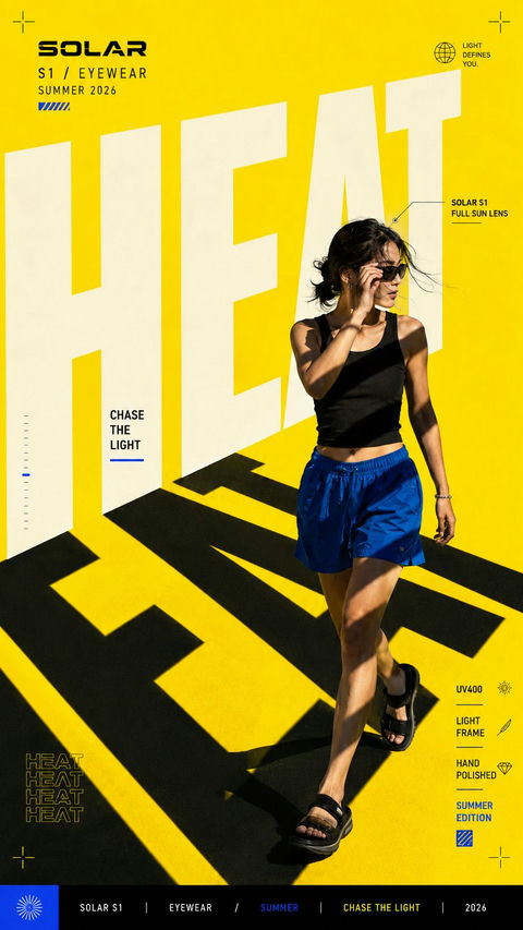
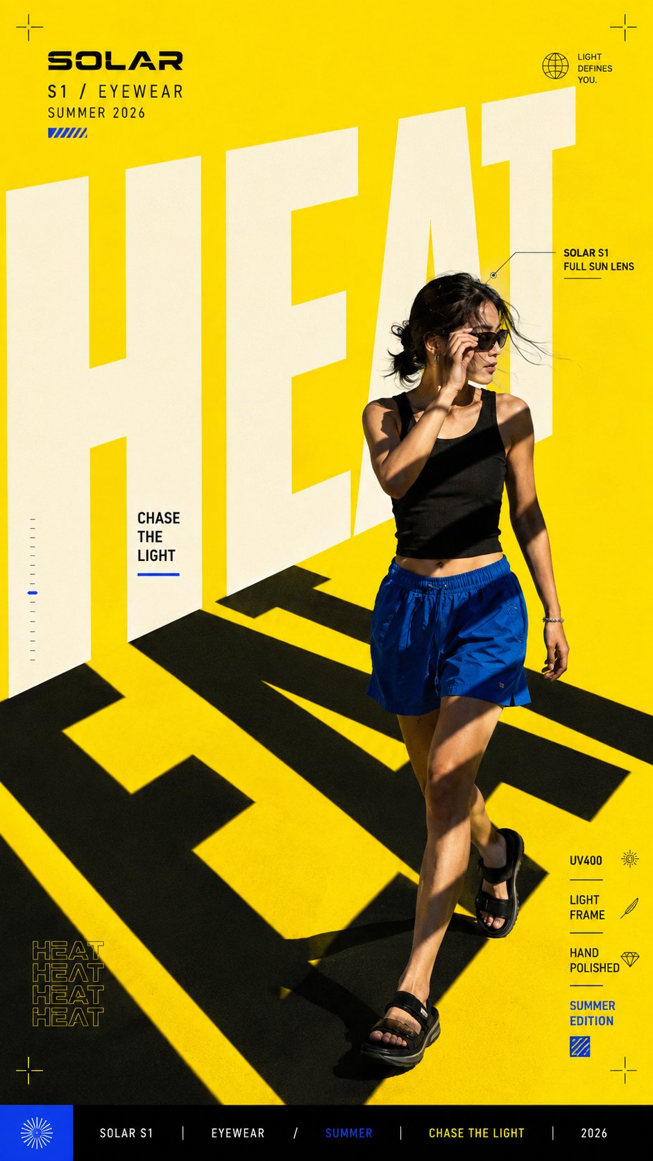
完整 Prompt
Create a bold editorial campaign poster where oversized typography actively shapes the visual concept instead of simply sitting in the background.

Brand: [BRAND NAME]
Product / Campaign: [PRODUCT OR CAMPAIGN]
Main Word: [SHORT WORD]
Subject / Product: [PERSON / PRODUCT / BOTH]
Typography Function: [SHADOW / FRAME / LIGHT / ROUTE / OTHER]
Main Color: [COLOR]
Accent Color: [COLOR]
Campaign Details: [SLOGAN / SPECS / DATE / OTHER]
Aspect Ratio: [9:16]

Use contemporary editorial design, realistic commercial photography, bold oversized typography, and a strong high-contrast color system.

Make the main word extremely large, filling roughly 50–75% of the composition. Allow letters to extend beyond the canvas, be cropped, overlap the subject, or use their negative space as part of the layout.

Most importantly, give the typography a clear visual function. For example, let the letters cast shadows across the subject, frame a product, shape the lighting, create a movement path, or organize the scene in another meaningful way.

The subject or product should interact naturally with this typography system so the text, photography, and graphic elements feel designed as one composition.

Use one dominant color with a contrasting secondary color, black, white, and only a small amount of accent color.

Add a few meaningful campaign details such as the brand name, product name, slogan, specifications, labels, route information, or small editorial text. Keep them organized and relevant to the actual concept instead of using random filler words.

Keep people, products, materials, lighting, and shadows realistic and polished. The final image should feel like a finished commercial campaign key visual — bold, colorful, editorial, and visually complete.
中文提示词
创建一个大胆的编辑活动海报,其中超大排版主动塑造视觉概念,而不仅仅是作为背景。

品牌:[品牌名称]
产品 / 活动:[产品或活动]
主要词汇:[短词]
主体 / 产品:[人物 / 产品 / 两者]
排版功能:[阴影 / 框架 / 光影 / 路径 / 其他]
主色:[颜色]
强调色:[颜色]
活动细节:[标语 / 规格 / 日期 / 其他]
纵横比:[9:16]

使用当代编辑设计、真实的商业摄影、大胆的超大排版和强力的高对比度色彩系统。

让主要词汇变得极大,填充构图的大约 50–75%。允许字母超出画布、被裁剪、与主体重叠,或者将其负空间作为版面的一部分。

最重要的是,赋予排版明确的视觉功能。例如,让字母在主体上投射阴影、为产品构建框架、塑造光线、创建运动路径,或以其他有意义的方式组织场景。

主体或产品应与此排版系统自然互动,使文本、摄影和图形元素感觉像是一个完整的构图。

使用一种主色调,搭配对比鲜明的辅助色、黑色、白色,以及少量的强调色。

添加一些有意义的活动细节,如品牌名称、产品名称、标语、规格、标签、路径信息或小型编辑文本。保持它们的组织性和与实际概念的相关性,而不是使用随机的填充词。

保持人物、产品、材料、灯光和阴影真实且精致。最终图像应感觉像是一张完成的商业活动主视觉图 —— 大胆、色彩丰富、具有编辑感且视觉完整。
来源与署名
- 原作者
- @MrLarus
- 公开出处
- 原始来源 ↗
- 收录图库
- OpenNana 条目 ↗
- 来源模型标注
- ChatGPT
- 条目日期
- 2026-08-25 · OpenNana 条目创建日期,不代表原帖发布日期
- 参考图要求
- 参考图要求未核实;请核对原帖和所用工具。
- 转载与权利
- 项目维护者确认转载授权;原作者权利保留
本站未逐条重新生图。原帖可访问性会变化,引用不代表独立验证作者身份或生成效果。